
Creating a "Web App": Part 1
I'm creating a web app, that is also my photography portfolio. Essentially killing two birds with one stone.

After completing my Terraform project, I now feel like it is time to do something hard. Well, the Terraform project was hard, but even harder. Something that I’ll be able to grow my Cloud & Cybersecurity skills all at once. I thought to myself,
“You should create a web application, then secure it.”
So that’s what I’m going to do. No plan at that point, so now it’s time to put it in motion. I want to preface this by saying this is just a starter app…if you would even call this an “app”. What I decided to do was host a static website on an S3 bucket, which will be my photography portfolio, and include some extra functionality like a contact form, visit counter, and whatever else comes to mind. I’m also going to secure the app and write the deployment in Terraform. I also want to say I’m not a developer, at least not yet, so this is going to take a while.
This blog is going to have multiple parts to make it more digestible, and hold a lot of problems that I run across and how I solve(d) them. Enjoy!
Landing Page
The first step is creating a landing page for when you get to the site. I envisioned my logo in the center of the page, and once you click on it you’re redirected to my site. After watching a few hours of HTML tutorials, I ended up with exactly what I was looking for.
<!DOCTYPE html>
<html>
<head>
  <title><!DOCTYPE html>
<html>
<head>
  <title>KweHen</title>
  <link rel="icon" href="https://simpleicon.com/wp-content/uploads/roll-film.png">
  <style>
    /* Reset some default styles */
    body, html {
      margin: 0;
      padding: 0;
      font-family: Arial, sans-serif;
    }

    /* Landing page styles */
    body {
      background-color: black;
    }

    .landing-page {
      display: flex;
      justify-content: center;
      align-items: center;
      height: 100vh;
    }

    .logo {
      max-width: 70%;
      text-align: center;
      margin-top: 20px;
    }

    .logo img {
      max-width: 100%;
      height: auto;
    }
  </style>
</head>
<body>
  <div class="landing-page">
    <a href="portfolio.html" class="logo">
      <img src="https://kwehenbucketobjects.s3.amazonaws.com/kwehen+white.png" alt="KweHen Logo">
    </a>
  </div>
</body>
</html></title>
  <link rel="icon" href="https://simpleicon.com/wp-content/uploads/roll-film.png">
  <style>
    /* Reset some default styles */
    body, html {
      margin: 0;
      padding: 0;
      font-family: Arial, sans-serif;
    }

    /* Landing page styles */
    body {
      background-color: black;
    }

    .landing-page {
      display: flex;
      justify-content: center;
      align-items: center;
      height: 100vh;
    }

    .logo {
      max-width: 70%;
      text-align: center;
      margin-top: 20px;
    }

    .logo img {
      max-width: 100%;
      height: auto;
    }
  </style>
</head>
<body>
  <div class="landing-page">
    <a href="portfolio.html" class="logo">
      <img src="https://BUCKETURL.s3.amazonaws.com/LOGO.png" alt="Site Logo">
    </a>
  </div>
</body>
</html>
This was about as easy as it will be for the rest of the creation of this site.
Redirection
Next was creating a temporary “portfolio.html” file for the site to redirect to. As seen in the code:
<a href="portfolio.html" class="logo">I wanted images to display in grayscale and show color once hovered over with a mouse or swiped on with a finger. I found Tailwind CSS to have a lot of the components I needed to be able to accomplish this. Unfortunately, I don’t have the time to learn Tailwind, and as I stated earlier, I am not a developer. With some help from AI, I translated Tailwind CSS into vanilla CSS which I could add to my code. Here’s what I got:
<!DOCTYPE html>
<html>
<head>
  <title>My Page</title>
  <style>
    @import url('https://fonts.googleapis.com/css2?family=Poppins:wght@400;700&display=swap');

    .image-container {
      width: calc(20% - 20px); /* Adjust the width and margin as desired */
      margin: 10px;
      float: left;
      clear: none;
      position: relative;
    }

    img.my-img {
      display: block;
      width: 100%;
      height: auto;
      max-width: 100%;
      transition: all 300ms;
      border-radius: 0.5rem;
      cursor: pointer;
      filter: grayscale(100%);
    }

    img.my-img:hover {
      filter: grayscale(0%);
    }

    .caption {
      text-align: center;
      margin-top: 5px;
      font-family: 'Poppins', sans-serif;
      font-size: 16px;
      color: #fff;
      background-color: rgba(0, 0, 0, 0.7);
      padding: 8px;
      border-radius: 0.5rem;
    }

    .clearfix::after {
      content: "";
      display: table;
      clear: both;
    }
  </style>
</head>
<body>
  <div class="image-container">
    <a href="https://example.com/page1">
      <img class="my-img" src="https://flowbite.s3.amazonaws.com/blocks/marketing-ui/content/content-gallery-3.png" alt="image description">
    </a>
    <div class="caption">Caption 1</div>
  </div>
  <!-- Repeat the image containers for the remaining images -->
  <div class="image-container">
    <a href="https://example.com/page2">
      <img class="my-img" src="https://flowbite.s3.amazonaws.com/blocks/marketing-ui/content/content-gallery-3.png" alt="image description">
    </a>
    <div class="caption">Caption 2</div>
  </div>

    <div class="image-container">
    <a href="https://example.com/page2">
      <img class="my-img" src="https://flowbite.s3.amazonaws.com/blocks/marketing-ui/content/content-gallery-3.png" alt="image description">
    </a>
    <div class="caption">Caption 2</div>
  </div>
    <div class="image-container">
    <a href="https://example.com/page2">
      <img class="my-img" src="https://flowbite.s3.amazonaws.com/blocks/marketing-ui/content/content-gallery-3.png" alt="image description">
    </a>
    <div class="caption">Caption 2</div>
  </div>
    <div class="image-container">
    <a href="https://example.com/page2">
      <img class="my-img" src="https://flowbite.s3.amazonaws.com/blocks/marketing-ui/content/content-gallery-3.png" alt="image description">
    </a>
    <div class="caption">Caption 2</div>
  </div>
    <div class="image-container">
    <a href="https://example.com/page2">
      <img class="my-img" src="https://flowbite.s3.amazonaws.com/blocks/marketing-ui/content/content-gallery-3.png" alt="image description">
    </a>
    <div class="caption">Caption 2</div>
  </div>
    <div class="image-container">
    <a href="https://example.com/page2">
      <img class="my-img" src="https://flowbite.s3.amazonaws.com/blocks/marketing-ui/content/content-gallery-3.png" alt="image description">
    </a>
    <div class="caption">Caption 2</div>
  </div>
    <div class="image-container">
    <a href="https://example.com/page2">
      <img class="my-img" src="https://flowbite.s3.amazonaws.com/blocks/marketing-ui/content/content-gallery-3.png" alt="image description">
    </a>
    <div class="caption">Caption 2</div>
  </div>
    <div class="image-container">
    <a href="https://example.com/page2">
      <img class="my-img" src="https://flowbite.s3.amazonaws.com/blocks/marketing-ui/content/content-gallery-3.png" alt="image description">
    </a>
    <div class="caption">Caption 2</div>
  </div>
    <div class="image-container">
    <a href="https://example.com/page2">
      <img class="my-img" src="https://flowbite.s3.amazonaws.com/blocks/marketing-ui/content/content-gallery-3.png" alt="image description">
    </a>
    <div class="caption">Caption 2</div>
  </div>
    <div class="image-container">
    <a href="https://example.com/page2">
      <img class="my-img" src="https://flowbite.s3.amazonaws.com/blocks/marketing-ui/content/content-gallery-3.png" alt="image description">
    </a>
    <div class="caption">Caption 2</div>
  </div>
    <div class="image-container">
    <a href="https://example.com/page2">
      <img class="my-img" src="https://flowbite.s3.amazonaws.com/blocks/marketing-ui/content/content-gallery-3.png" alt="image description">
    </a>
    <div class="caption">Caption 2</div>
  </div>
    <div class="image-container">
    <a href="https://example.com/page2">
      <img class="my-img" src="https://flowbite.s3.amazonaws.com/blocks/marketing-ui/content/content-gallery-3.png" alt="image description">
    </a>
    <div class="caption">Caption 2</div>
  </div>
    <div class="image-container">
    <a href="https://example.com/page2">
      <img class="my-img" src="https://flowbite.s3.amazonaws.com/blocks/marketing-ui/content/content-gallery-3.png" alt="image description">
    </a>
    <div class="caption">Caption 2</div>
  </div>
    <div class="image-container">
    <a href="https://example.com/page2">
      <img class="my-img" src="https://flowbite.s3.amazonaws.com/blocks/marketing-ui/content/content-gallery-3.png" alt="image description">
    </a>
    <div class="caption">Caption 2</div>
  </div>
  <!-- Add more image containers as needed -->
  <div class="clearfix"></div>
</body>
</html>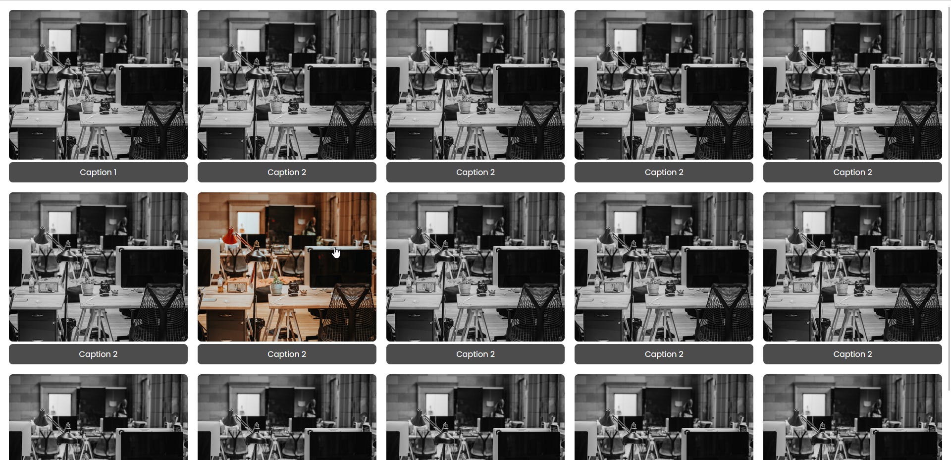
I also changed the background, added a heading, and a sidebar that will be changed later. All placeholder values, just a template that I created that I could work off of and change while I go through the creation of the site. It’s funny writing a blog about this, it can be digested so fast, yet this took me such a long time.
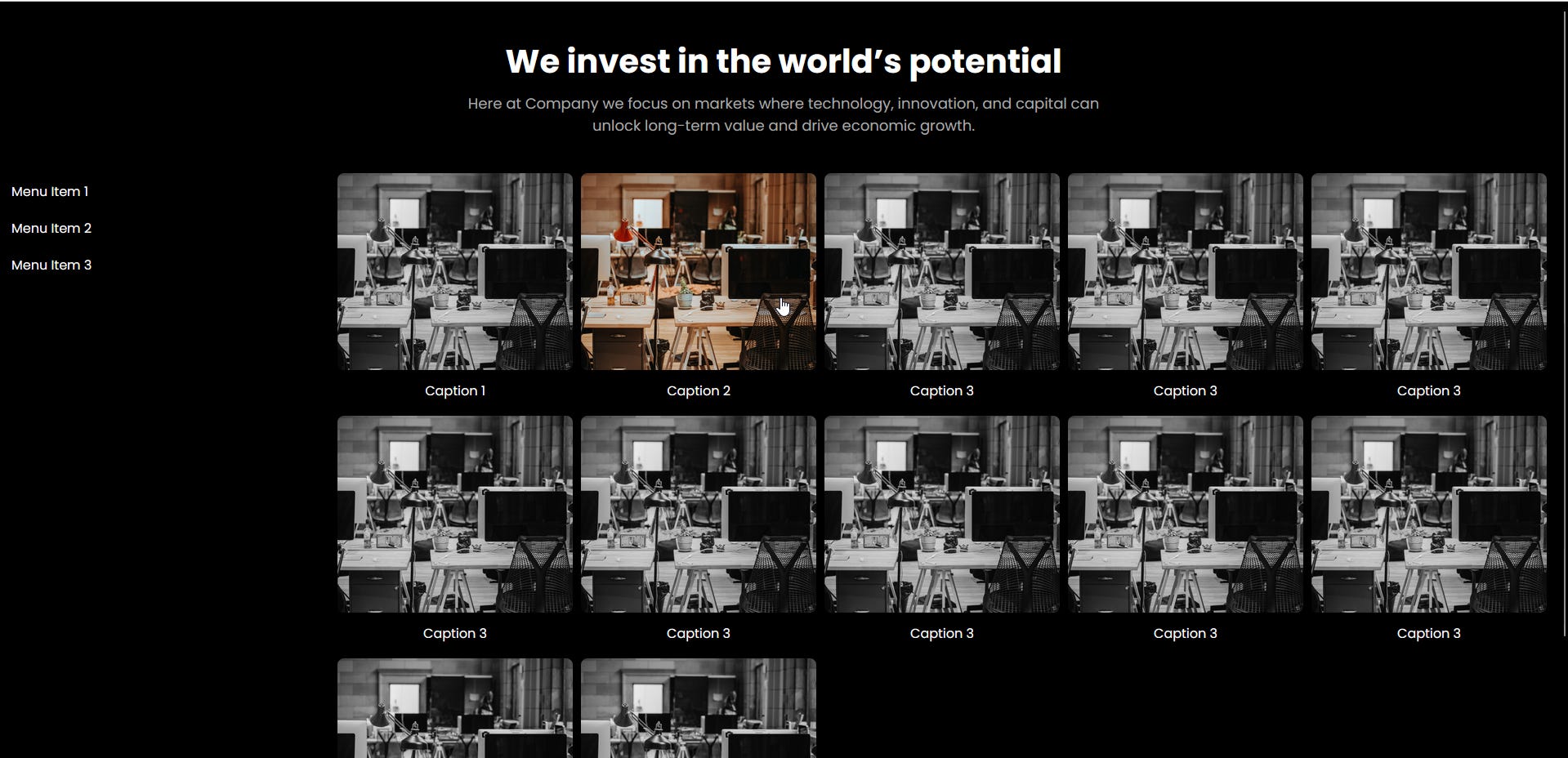
As you can see, the site is yet to be formatted properly but we are moving in the right direction. The header will be changed, images will be added, and sidebar can be formatted properly, one step at a time.
Terraform
I want to be able to spin this site up with a Terraform deployment. So as I go through creating the site, I incrementally created this TF file with the resources needed for this website. Originally this was just a public S3 bucket, with objects uploaded to it, a bucket policy for static s3 buckets, and the "aws_s3_bucket_website_configuration".
resource "aws_s3_bucket" "kwehen1" {
  bucket        = "kwehen1"
  force_destroy = true

  tags = {
    Name = "kwehen1"
  }
}

resource "aws_s3_bucket_ownership_controls" "kwehen-controls" {
  bucket = aws_s3_bucket.kwehen1.id

  rule {
    object_ownership = "BucketOwnerEnforced"
  }
}

resource "aws_s3_bucket_public_access_block" "kwehen-access-block" {
  bucket                      = aws_s3_bucket.kwehen1.id
  block_public_acls           = false
  block_public_policy         = false
  ignore_public_acls          = false
  restrict_public_buckets     = false
}

resource "aws_s3_object" "index" {
  bucket = aws_s3_bucket.kwehen1.id
  key    = "index.html"
  source = "/Users/kwehen/Desktop/AWS/Static Portfolio/index.html"
}

resource "aws_s3_object" "error" {
  bucket = aws_s3_bucket.kwehen1.id
  key    = "404.html"
  source = "/Users/kwehen/Desktop/AWS/Static Portfolio/404.html"
}

resource "aws_s3_object" "portfolio" {
  bucket = aws_s3_bucket.kwehen1.id
  key = "portfolio.html"
  source = "/Users/kwehen/Desktop/AWS/Static Portfolio/portfolio.html"
}

resource "aws_s3_bucket_policy" "kwehen-policy" {
  bucket = aws_s3_bucket.kwehen1.id

  policy = <<EOF
{
  "Version": "2012-10-17",
  "Statement": [
    {
      "Sid": "PublicReadGetObject",
      "Effect": "Allow",
      "Principal": "*",
      "Action": ["s3:GetObject"],
      "Resource": ["arn:aws:s3:::kwehen1/*"]
    }
  ]
}
EOF
}

resource "aws_s3_bucket_website_configuration" "kwehen-config" {
  bucket = aws_s3_bucket.kwehen1.id

  index_document {
    suffix = "index.html"
  }

  error_document {
    key = "404.html"
  }
}

output "bucket_domain_name" {
  value = aws_s3_bucket.kwehen1.website_endpoint
}
I quickly figured out that this does not work. HTML files that are uploaded to S3 for static websites need to be uploaded with the argument: content_type = "text/html".
More information on setting up a static website on S3 can be found all over the internet. Here is the AWS Documentation on configuring a static site on S3.
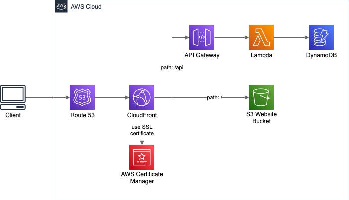
What to Expect in Part 2:
In part two, I’ll be getting out of the template for the redirection page, uploading some images to this page, and configuring Cloudfront for the site with Terraform. After I get all the “simple” stuff figured out I can move on to securing the site. Everything will be done incrementally, one feature of the site may take days. I’m writing this blog now after being on the computer for 15 hours today, just trying to set up a serverless contact form. Stay tuned for part 2.